
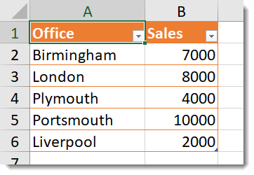
Plotting data onto a map is a regular request when a company has data that is location based. In this post, we will look at some simple tips to plot data onto a map. The final map will show a bubble for each location, the size will depend upon the sales. The data is an Excel table with office and sales columns.
First Attempt at Mapping Data
Step 1: With the above Excel table loaded into the report, select a map visualisation.
Step 2: Next tick the Office and Sales column in the Fields Pane to add the data to the map.
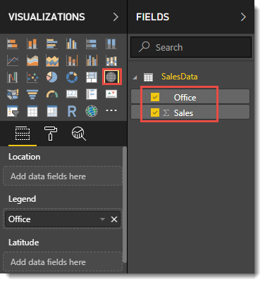
Step 3: The Office column does not go to the location field in the visualisation pane.
It goes to Legend rather than Location. You could drag Office into Location but it would be easier if it Power BI guessed right the first time.
Second Attempt at Mapping Data
Step 1: Start in the data view and looking at the Sales data.
Step 2: Select the Office column and on the Modelling ribbon change Data Category to City. The Office column will now show a globe symbol next to it.
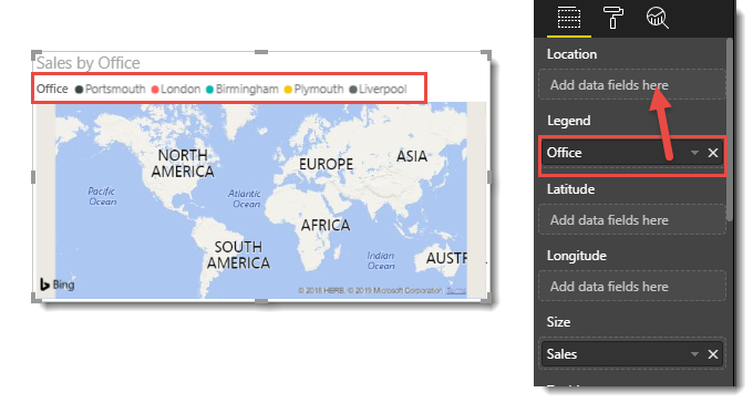
Step 3: Create a map visual same as the first attempt.
This time Power BI guesses correctly and Office field into Location.
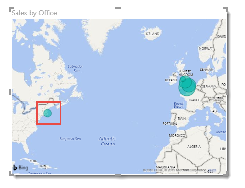
Step 4: Everything looks great except Plymouth isn’t showing in SW England but is showing in America. City names are not unique across the world so Power BI guesses and will get some wrong.
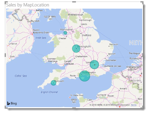
Third Attempt at Mapping Data
Step 1: We return back to the data view and look at the Sales table.
Step 2: On the Modelling Ribbon, click New Column and enter the following formula:
MapLocation = SalesData[Office] & ", United Kingdom"
This adds the country to the office column to remove any ambiguity. Obviously, if your data is international the calculation will be more complex.
- Change the Data Category of the new column to Place.
- Add the Map visualisation just as before using your new column. Plymouth is now based in the UK and the map is complete
Conclusion
Mapping data can be a useful report and can give a clear message if used correctly. If you have access to Longitude and Latitude you will get a more accurate plot, no country is required. Do remember to change the data categories of the columns.
