
Visualizing SharePoint List data as a Chart is hard.
Or is it?
If you’ve ever been asked to create beautiful looking charts with filtering, drill-downs and plenty of other bells and whistles, then you may be surprised to know that it’s very doable (and in some cases really easy).
However, to do it you need to use a Charting Tool that doesn’t come prepackaged with SharePoint.
This post lists 13 tools that help you get the job done and make you look like a charting Ninja!
Before we get started some of you maybe wondering if it’s possible to get your SharePoint List data synchronised into a SQL Table (where it’s easy to connect a plethora of reporting / charting tools). At Collab365 we’ve partnered with AxioWorks to bring you an awesome 10% discount on their popular SQList tool which does exactly this! (Use discount code : “Collab365-10″),
You need other reporting options?
Let’s get started with these 13 tools…
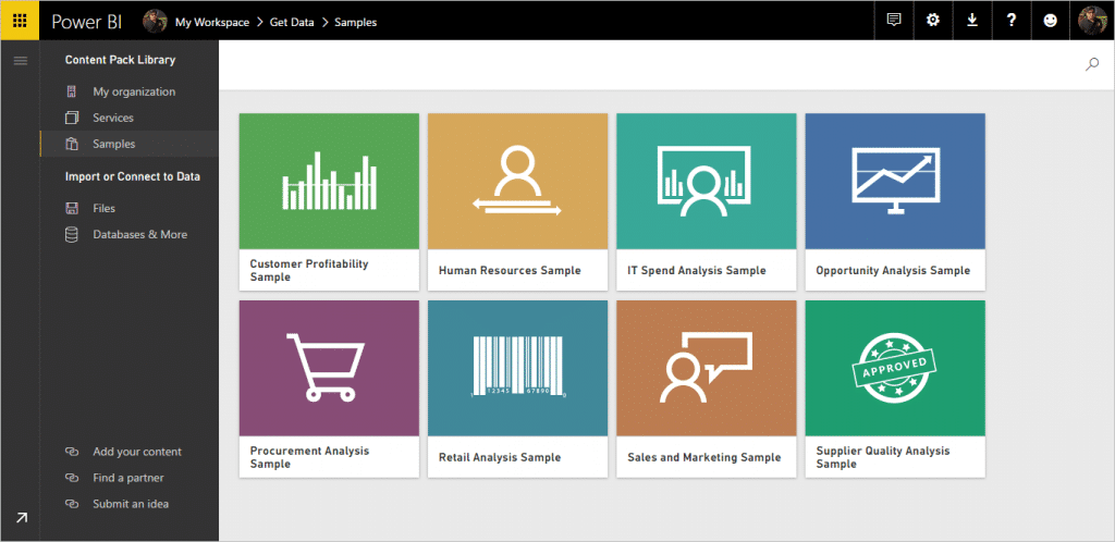
1. Power BI
Power BI is one of Microsoft’s newest services. It supports hybrid architecture to connect with cloud and on premise data sources. And, it is capable of displaying data intuitively in an immersive way using an interactive user interface. Power BI simplify the complex data using dataset to represent inform of Reports and Dashboard. There are various features available in Power BI to drill down the data charts and Dashboard.
Power BI tools & services are available for desktop, mobile and cloud. Below is a link for more information and to learn Power BI.
Find out more:
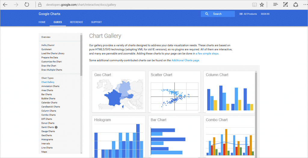
2. Google Chart Web Part
This is a free, powerful chart web part developed by Google, and this is being used widely for reporting from SharePoint lists. This offers you the ability to create different type of chart using SharePoint list. You need to plug in the existing HTML5 based code to display intuitive chart graph. It’s very easy to integrate and extend as per our requirement.
Find out more:
- https://developers.google.com/chart/interactive/docs/gallery
- Visualizing Data Using SharePoint and Google Charts
- Free WebPart by Amerin to make the job easier.
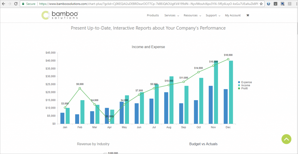
3. Bamboo Charts for SharePoint
A paid tool implemented by Bamboo Solutions, to create real time interactive charts from SharePoint lists and other data sources. This tool allows you to configure the settings at run time so you can drill-down more information if needed. Also, you can export reports in PDF and other formats. This web part allows to develop and integrate custom code to extend the built in functionality by doing the configuration at client end.
This web part is available for SharePoint 2010, 2013 and 2016 on premises.
Find out more:
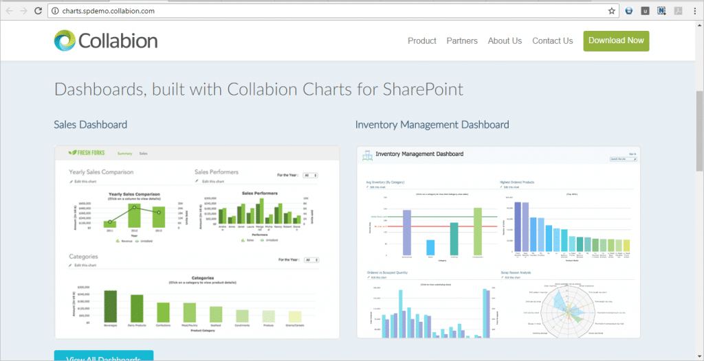
4. Collabion Charts for SharePoint
This is a third party tool introduced by Collabion, to create an interactive dashboard from SharePoint list data. This enables users to configure data from multiple external data sources, and it’s capable of showing aggregated information with details that can further drill down to see. You can download this software and edit it as per your need.
Using this web part, you can create different types of charts and interactive features like tool-tip, zooming etc. to make dashboard more interactive to present meaningful information. It works with all version on SharePoint on premise. Below is the link for more detail about this.
Find out more:
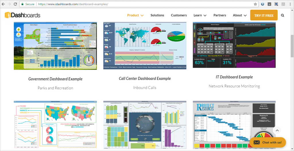
5. iDashboards
iDashboards provides data visualization software as a self-service platform. This software is an inexpensive, reliable and user friendly tool that allows you to create interactive dashboards by consuming data from SharePoint lists and multiple data sources. This also allows to convert generated reports in PDF, HTML and Excel format.
This software embeds with local or on premise version of SharePoint. Developers can extend the existing functionality by customizing the solution.
Find out more:
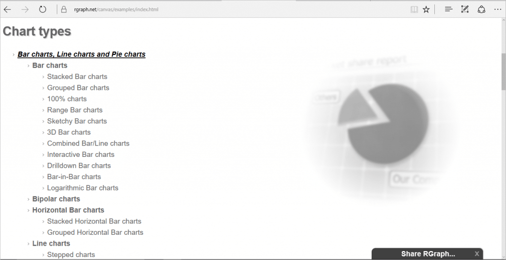
6. RGraph Charts (HTML 5)
RGraph Software offers RGraph libraries with HTML 5 Canvas and SVG RGraph that can be used to generate charts by consuming data from SharePoint list. This library is free and available to download from the link below.
Using these libraries, you can create twenty charts types from SharePoint lists.
Find out more:
7. Reporting Services using SharePoint List Connection Type (SSRS)
This is developed by Microsoft and it requires a license of SQL Server. This feature of reporting services enables user to get the data from the SharePoint list directly. For this, we need to create a dataset based on the data source of type Microsoft SharePoint list. It uses report builder inside to add data connection and verify the credentials. The developer can create customized solutions to enhance the features and functionality. This is available for all versions of on premise SharePoint.
Using this tool, you can create charts, views, tables, gauges, interactive maps etc. Kindly refer below link for more information
- https://msdn.microsoft.com/en-us/library/ee633650.aspx
- https://technet.microsoft.com/en-us/library/ms156450(v=sql.105).aspx
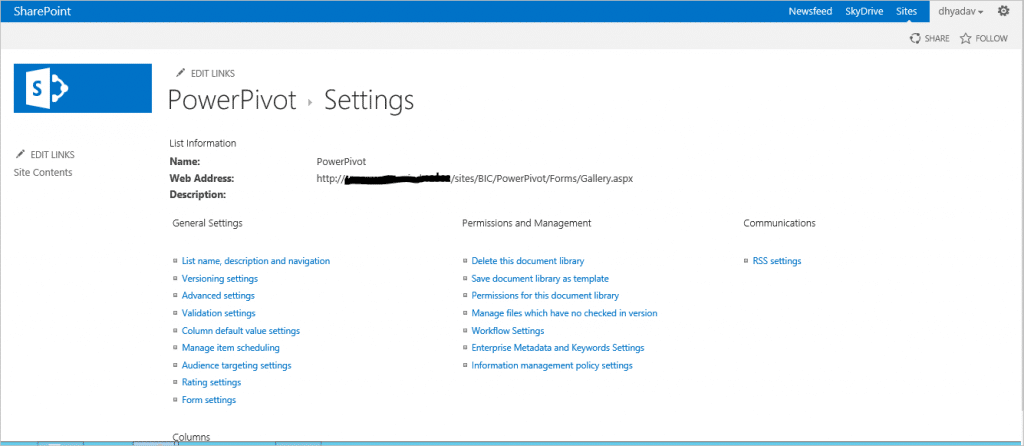
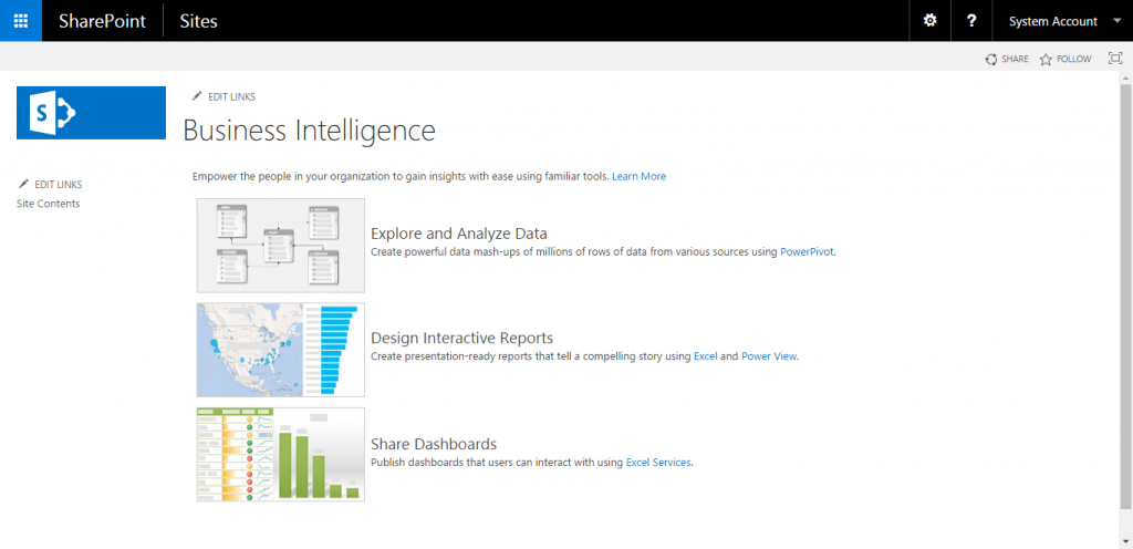
8. Power Pivot
This tool enables users to create large and multi table data model that can have complex relationship in data tables and hierarchies. This tool allows to create a pivot table with filters. Also, you pull data from external data sources to your pivot table by data import feature.
This feature is deprecated in SharePoint 2016. However, it can be added using SharePoint Server 2016 from Office Online Server.
- https://msdn.microsoft.com/en-us/library/mt614795.aspx
- https://msdn.microsoft.com/en-us/library/gg413412(v=sql.110).aspx
9. Power View
This is created by Microsoft, and it helps you to create interactive data exploration visualization, and can extract data in form of table, matrix, map and chart etc. This feature is deprecated in SharePoint 2016. However, it can be added using SharePoint Server 2016 from Office Online Server.
You can create multiple view inside a view with tabular data. It allows to filter, sort, slice and highlight data.

10. Excel Services
Excel Services allows to create dashboards, scorecards and reports by connecting data from multiple data sources. You can filter, sort, slice the data in worksheets. Also, you can use explorer to browse additional information if required. This feature is deprecated in SharePoint 2016. However, it can be added using SharePoint Server 2016 from Office Online Server.
You can create charts and tables to represent meaningful information.
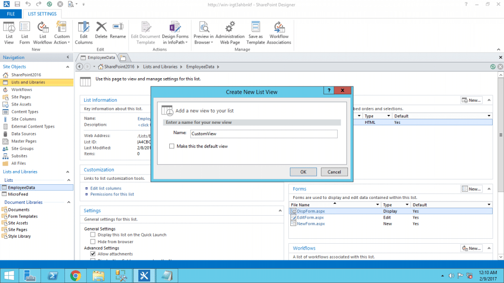
11. Microsoft SharePoint Designer
SharePoint Designer can be used to create custom view of the SharePoint list where you can change the filter, sorting order, showing and hiding of the columns. You can connect this view with other lists. Also, you can do the layout changing by applying conditional formatting to the list.
This tool is not available for Microsoft SharePoint 2016, however, SharePoint Designer 2013 SP1 can be used for Microsoft SharePoint 2016.
Find out more:
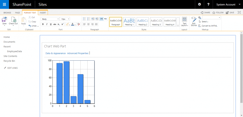
12. Chart Web Part
This web part was created by Microsoft and This web part is also deprecated in SharePoint 2013 and SharePoint 2016, however, it can be embedded by adding “Microsoft.Office.Server.WebControls.ChartWebPart” as workaround for it.
This can be created and added in SharePoint site to enable users to see performance details in a glance. Using Chart web part, data can be shared as data source for other chart web part. Also, User can connect external data using BCS from external data source.
Find out more:
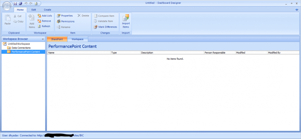
13. PerformancePoint Dashboard Designer tool
This tool is developed by Microsoft. PerformancePoint services allows user to create rich custom dashboards and scorecards using multiple data sources. You can extend the functionality for services to Report view, Filters and Tabular data sources by setting up built-in properties.
Today, there are many more tools are available in the market for report with advance features. So, you can choose a best tool based on your requirements and features that you want to include in your reporting to make it jazzier and intuitive. Find our more information on below link
Do you know of any other charting solution for SharePoint? If so leave a comment and I will happily add them.
