
Tabbed forms are ideal when a form has more controls than screen space. It really helps to use a tabbed form to group items and keep the visible size of your forms manageable. Unfortunately, PowerApps doesn’t ship with a tabbed form so we need to create one using a gallery and some groups of controls.
The steps to create this form are:
- Create a collection of tab names
- Create a gallery
- Create a group for each tab with a visible property
Create a collection
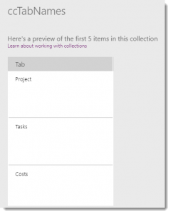
For this form, I’m going to hard-code the tab names into a collection. This code needs to be in the OnStart of the app and for testing purposes in a button as well. The collection just needs to contain the tab names.
ClearCollect(
    ccTabNames,
    {Tab: "Project"},
    {Tab: "Tasks"},
    {Tab: "Costs"}
)
This creates a collection with three rows of data.
Build a Gallery
A gallery will create the tabs, each tab will be a label that changes colour based on which gallery item is selected.
Step 1: Insert a blank horizontal gallery.
Step 2: Make the data the collection “ccTabNames” created in the last part.
Step 3: Update the gallery to have the following properties.
| Gallery Name | GalleryTabs |
| Width | GalleryTabs.TemplateWidth * CountRows(GalleryTabs.AllItems) |
| Height | 40 |
| Template Size | 150 |
| Padding | 0 |
Step 4: Add a label to the gallery template and update to have the following properties.
| Label Name | TabName |
| Text | ThisItem.Tab |
| Height | Parent.TemplateHeight |
| Width | Parent.TemplateWidth – 3 |
| Fill | If(ThisItem.IsSelected, Blue , LightBlue ) |
| Color | White |

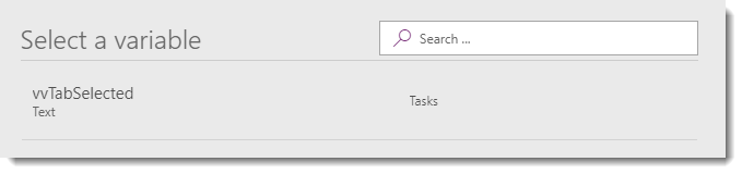
Step 5: Change the “OnSelect” of the label to update a variable, “vvTabSelected”, to the tab value.

Test your tabs in preview mode. You will need to click the button to run the code created in the previous section.
Tip: View the variables to check the tab value is being saved.
Groups of Controls
The last stage is to create the groups of controls associated with each tab, they will be surrounded by a rectangle with a white fill and a coloured border that matches the selected tab.
Step 1: Insert a rectangle from the Icons drop down, and modify the properties. In this example, the rectangle hasn’t yet been renamed.
| X | GalleryTabs.X+Rectangle1.BorderThickness/2 |
| Y | GalleryTabs.Y+GalleryTabs.Height |
| Width | 800 or whatever fits your app |
| Height | 500 or whatever fits your app |
| Fill | White |
| Border Color | Blue |
| Border Width | 2 |
Step 2: Add the controls for that tab.
Step 3: Select the rectangle and all the controls for the tab and group them together. Rename the group to match the tab, e.g. GroupProject.
Step 4: Select the group which will select all the items and change the visible property to:
vvTabSelected="Project"

Repeat steps 1 – 4 for each tab required and remember to test as you go.
Conclusion
Congratulations on building a tabbed form.